The Ascribed Advantage
How much more do men earn doing the same job as women? In this exploration, I will examine if the gender pay gap exists, in what jobs and how much is it. Specifically, this dataset is from United Kingdom. It was part of #tidytuesday event and can be downloaded from this link.
This online tool lets you visualise the difference by gender and occupation. If you’re feeling brave, try this quiz too.
Let’s begin
knitr::opts_chunk$set(collapse = TRUE, out.width = "100%")

library(tidyverse)
## ── Attaching core tidyverse packages ──────────────────────── tidyverse 2.0.0 ──
## ✔ dplyr 1.1.2 ✔ readr 2.1.4
## ✔ forcats 1.0.0 ✔ stringr 1.5.0
## ✔ ggplot2 3.4.3 ✔ tibble 3.2.1
## ✔ lubridate 1.9.2 ✔ tidyr 1.3.0
## ✔ purrr 1.0.2
## ── Conflicts ────────────────────────────────────────── tidyverse_conflicts() ──
## ✖ dplyr::filter() masks stats::filter()
## ✖ dplyr::lag() masks stats::lag()
## ℹ Use the conflicted package (<http://conflicted.r-lib.org/>) to force all conflicts to become errorslibrary(DT)
ggthemr::ggthemr('dust')
paygap_raw = read_csv("https://raw.githubusercontent.com/rfordatascience/tidytuesday/master/data/2022/2022-06-28/paygap.csv")## Rows: 48711 Columns: 27
## ── Column specification ────────────────────────────────────────────────────────
## Delimiter: ","
## chr (9): employer_name, address, post_code, company_number, sic_codes, com...
## dbl (15): employer_id, diff_mean_hourly_percent, diff_median_hourly_percent...
## lgl (1): submitted_after_the_deadline
## dttm (2): due_date, date_submitted
##
## ℹ Use `spec()` to retrieve the full column specification for this data.
## ℹ Specify the column types or set `show_col_types = FALSE` to quiet this message.glimpse(paygap_raw)## Rows: 48,711
## Columns: 27
## $ employer_name <chr> "Bryanston School, Incorporated", "RED BA…
## $ employer_id <dbl> 676, 16879, 17677, 682, 17101, 687, 17484…
## $ address <chr> "Bryanston House, Blandford, Dorset, DT11…
## $ post_code <chr> "DT11 0PX", "EH6 8NU", "LS7 1AB", "TA6 3J…
## $ company_number <chr> "00226143", "SC016876", "10530651", "0672…
## $ sic_codes <chr> "85310", "47730", "78300", "93110", "5621…
## $ diff_mean_hourly_percent <dbl> 18.0, 2.3, 41.0, -22.0, 13.4, 15.1, 15.0,…
## $ diff_median_hourly_percent <dbl> 28.2, -2.7, 36.0, -34.0, 8.1, 2.8, 0.0, 0…
## $ diff_mean_bonus_percent <dbl> 0.0, 15.0, -69.8, -47.0, 41.4, 77.6, 0.0,…
## $ diff_median_bonus_percent <dbl> 0.0, 37.5, -157.2, -67.0, 43.7, 71.2, 0.0…
## $ male_bonus_percent <dbl> 0.0, 15.6, 50.0, 25.0, 8.7, 5.8, 0.0, 0.0…
## $ female_bonus_percent <dbl> 0.0, 66.7, 73.5, 75.0, 3.2, 4.2, 0.0, 0.0…
## $ male_lower_quartile <dbl> 24.4, 20.3, 0.0, 56.0, 29.1, 42.6, 10.0, …
## $ female_lower_quartile <dbl> 75.6, 79.7, 100.0, 44.0, 70.9, 57.4, 90.0…
## $ male_lower_middle_quartile <dbl> 50.8, 25.4, 2.0, 52.0, 49.4, 45.2, 9.0, 5…
## $ female_lower_middle_quartile <dbl> 49.2, 74.6, 98.0, 48.0, 50.6, 54.8, 91.0,…
## $ male_upper_middle_quartile <dbl> 49.2, 10.3, 11.0, 30.0, 22.8, 46.8, 10.0,…
## $ female_upper_middle_quartile <dbl> 50.8, 89.7, 89.0, 70.0, 77.2, 53.2, 90.0,…
## $ male_top_quartile <dbl> 51.5, 18.1, 23.0, 24.0, 58.2, 35.5, 9.0, …
## $ female_top_quartile <dbl> 48.5, 81.9, 77.0, 76.0, 41.8, 64.5, 91.0,…
## $ company_link_to_gpg_info <chr> "https://www.bryanston.co.uk/employment",…
## $ responsible_person <chr> "Nick McRobb (Bursar and Clerk to the Gov…
## $ employer_size <chr> "500 to 999", "250 to 499", "250 to 499",…
## $ current_name <chr> "BRYANSTON SCHOOL INCORPORATED", "\"RED B…
## $ submitted_after_the_deadline <lgl> FALSE, FALSE, TRUE, TRUE, FALSE, FALSE, F…
## $ due_date <dttm> 2018-04-05, 2018-04-05, 2018-04-05, 2018…
## $ date_submitted <dttm> 2018-03-27 11:42:49, 2018-03-28 16:44:25…The variables that actually look at the differences here are the variables that contain “diff” in their name. Let’s look at those variables in detail.
paygap_raw |>
  select(contains("diff"))
## # A tibble: 48,711 × 4
##    diff_mean_hourly_percent diff_median_hourly_percent diff_mean_bonus_percent
##                       <dbl>                      <dbl>                   <dbl>
##  1                     18                         28.2                     0
##  2                      2.3                       -2.7                    15
##  3                     41                         36                     -69.8
##  4                    -22                        -34                     -47
##  5                     13.4                        8.1                    41.4
##  6                     15.1                        2.8                    77.6
##  7                     15                          0                       0
##  8                     11.9                        0                       0
##  9                     13.4                        8.5                    62.9
## 10                     15.3                        6.9                    55.5
## # ℹ 48,701 more rows
## # ℹ 1 more variable: diff_median_bonus_percent <dbl>
There are four variables. First two are differences in hourly pay (mean and median) and last two are differences in bonus (mean and median). The positive numbers have to be interpreted as men earning as much more than women in that company/organisation.
A useful variable is the SIC code, stands for standard industrial classification of economic activities. It identifies the business that the company is operating in.
paygap_raw |>
  select(contains("sic"))
## # A tibble: 48,711 × 1
##    sic_codes
##    <chr>
##  1 85310
##  2 47730
##  3 78300
##  4 93110
##  5 56210:70229
##  6 93110:93130:93290
##  7 86900:88100
##  8 56290
##  9 1470:10910
## 10 10120
## # ℹ 48,701 more rows
As can be noticed, some companies have more than one SIC code. Let’s separate them with seperate_rows() function from tidyr. Then, let’s count them to see which ones are the most common.1
paygap_raw |>
  select(sic_codes) |>
  separate_rows(sic_codes, sep = ":") |>
  count(sic_codes, sort = TRUE)
## # A tibble: 639 × 2
##    sic_codes     n
##    <chr>     <int>
##  1 1          6584
##  2 85310      3020
##  3 <NA>       2894
##  4 82990      2588
##  5 85200      2219
##  6 84110      1886
##  7 70100      1541
##  8 86900      1246
##  9 78200      1149
## 10 86210      1074
## # ℹ 629 more rows
But what do these SIC codes mean? Let’s check out! The CSV file is available at UK government’s website.
uk_sic_codes = read_csv("https://assets.publishing.service.gov.uk/government/uploads/system/uploads/attachment_data/file/527619/SIC07_CH_condensed_list_en.csv")
## Rows: 731 Columns: 2
## ── Column specification ────────────────────────────────────────────────────────
## Delimiter: ","
## chr (2): SIC Code, Description
##
## ℹ Use `spec()` to retrieve the full column specification for this data.
## ℹ Specify the column types or set `show_col_types = FALSE` to quiet this message.
uk_sic_codes
## # A tibble: 731 × 2
##    `SIC Code` Description
##    <chr>      <chr>
##  1 01110      Growing of cereals (except rice), leguminous crops and oil seeds
##  2 01120      Growing of rice
##  3 01130      Growing of vegetables and melons, roots and tubers
##  4 01140      Growing of sugar cane
##  5 01150      Growing of tobacco
##  6 01160      Growing of fibre crops
##  7 01190      Growing of other non-perennial crops
##  8 01210      Growing of grapes
##  9 01220      Growing of tropical and subtropical fruits
## 10 01230      Growing of citrus fruits
## # ℹ 721 more rows
The variable name needs to be cleaned.
uk_sic_codes = uk_sic_codes |>
  janitor::clean_names()
uk_sic_codes
## # A tibble: 731 × 2
##    sic_code description
##    <chr>    <chr>
##  1 01110    Growing of cereals (except rice), leguminous crops and oil seeds
##  2 01120    Growing of rice
##  3 01130    Growing of vegetables and melons, roots and tubers
##  4 01140    Growing of sugar cane
##  5 01150    Growing of tobacco
##  6 01160    Growing of fibre crops
##  7 01190    Growing of other non-perennial crops
##  8 01210    Growing of grapes
##  9 01220    Growing of tropical and subtropical fruits
## 10 01230    Growing of citrus fruits
## # ℹ 721 more rows
Visualise Differences
Which companies have the highest differences?
paygap_raw |>
  slice_max(order_by = diff_median_hourly_percent, n = 10) |>
  select(employer_name) |>
  unique()
## # A tibble: 16 × 1
##    employer_name
##    <chr>
##  1 Shrewsbury Academies Trust
##  2 ASH & LACY FINISHES LIMITED
##  3 BEERE ELECTRICAL SERVICES LIMITED
##  4 HARVEY NICHOLS (OWN BRAND) STORES LIMITED
##  5 HARVEY NICHOLS RESTAURANTS LIMITED
##  6 J.C.B.EARTHMOVERS LIMITED
##  7 J5C MANAGEMENT LIMITED
##  8 JCB COMPACT PRODUCTS LIMITED
##  9 JCB POWER SYSTEMS LIMITED
## 10 KALSI PLASTICS (UK) LIMITED
## 11 M. ANDERSON CONSTRUCTION LIMITED
## 12 PLAYNATION LIMITED
## 13 PSJ FABRICATIONS LTD
## 14 WALTERS RESOURCES LIMITED
## 15 ATFC LIMITED
## 16 HPI UK HOLDING LTD.
J.C.B. is the only familiar name to me. Is the difference one of the highest because of the business it’s involved in? Construction sector doesn’t employ many women. (If you’re curious why there are 16 names when I asked for top-10, it’s because some companies/roles have equal pay difference.)
Which companies have the lowest differences?
paygap_raw |>
  slice_min(order_by = diff_median_hourly_percent, n = 10) |>
  select(employer_name) |>
  unique()
## # A tibble: 10 × 1
##    employer_name
##    <chr>
##  1 ANKH CONCEPTS HOSPITALITY MANAGEMENT LIMITED
##  2 NSS CLEANING LIMITED
##  3 G4S SECURE SOLUTIONS (UK) LIMITED
##  4 AUTO-SLEEPERS GROUP LIMITED
##  5 AUTO-SLEEPERS INVESTMENTS LIMITED
##  6 BAR 2010 LIMITED
##  7 INBRELLA LIMITED
##  8 DONALDSON TIMBER ENGINEERING LIMITED
##  9 FORTEL SERVICES LIMITED
## 10 SPRINGFIELD PROPERTIES PLC
Some of these look like housekeeping companies.
Distribution of Hourly Pay
Let’s start by seeing distribution of median difference in hourly pay.
paygap_raw |>
  ggplot(aes(diff_median_hourly_percent / 100)) +
  geom_histogram(bins = 25) +
  scale_x_continuous(limits = c(-0.5, 0.5), labels = scales::percent) +
  ylim(c(0, 10000)) +
  labs(x = "Difference",
       y = "Count",
       caption = "A value of 10% implies that men earn 10% more hourly wage than women.",
       title = "Median Hourly Pay Difference")
## Warning: Removed 901 rows containing non-finite values (`stat_bin()`).
## Warning: Removed 2 rows containing missing values (`geom_bar()`).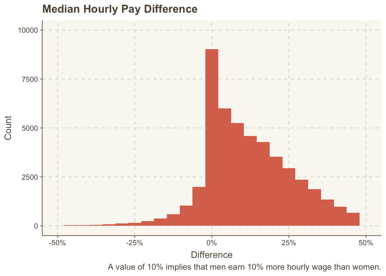
There are a lot of companies that are on the positive side than they are on the negative side.
Distribution of Bonus
paygap_raw |>
  ggplot(aes(diff_median_bonus_percent / 100)) +
  geom_histogram(bins = 25) +
  scale_x_continuous(limits = c(-0.5, 0.5), labels = scales::percent) +
  ylim(c(0, 10000)) +
  labs(x = "Difference",
       y = "Count",
       caption = "A value of 10% implies that men earned 10% more bonus than women.",
       title = "Median Bonus Difference")
## Warning: Removed 19163 rows containing non-finite values (`stat_bin()`).
## Warning: Removed 2 rows containing missing values (`geom_bar()`).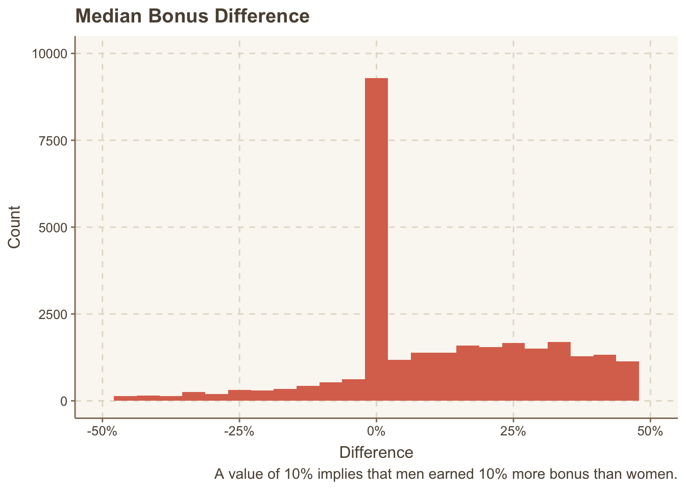
Ooooh. In most cases, the difference in bonus is zero. Let’s see which companies have the highest difference in bonus.
paygap_raw |>
mutate(diff_median_bonus_percent = diff_median_bonus_percent/100) |>
slice_max(diff_median_bonus_percent, n = 10) |>
select(contains("employer"), diff_median_bonus_percent)
## # A tibble: 10 × 4
## employer_name employer_id employer_size diff_median_bonus_pe…¹
## <chr> <dbl> <chr> <dbl>
## 1 The Order of St. Augustine … 17584 250 to 499 40
## 2 BOWDRAPER LIMITED 2275 500 to 999 38.5
## 3 PRISM UK MEDICAL LIMITED 10055 250 to 499 3.36
## 4 ROBINSON MEDICAL RECRUITMEN… 17323 500 to 999 3.24
## 5 RED RECRUITMENT PARTNERSHIP… 10332 Less than 250 3.17
## 6 CARE BY US LTD 16116 500 to 999 3.12
## 7 TRIFORDS LIMITED 12941 250 to 499 2.86
## 8 VALE OF GLAMORGAN HOTEL LIM… 13230 250 to 499 2.81
## 9 TRAFFORD LEISURE COMMUNITY … 17413 250 to 499 1.92
## 10 The Healthcare Management T… 12394 250 to 499 1.9
## # ℹ abbreviated name: ¹diff_median_bonus_percentWhat do we have here… The Order of St. Augustine of the Mercy of Jesus (Roman Catholic Church) has the highest difference in bonus: 40%. Bowdraper is a cleaning service company.
To proceed, I need to join the SIC code values to that data frame. Before that, I have to separate the SIC codes which can be separated using :.
paygap_joined = paygap_raw |>
  #select(employer_name, diff_median_hourly_percent, sic_codes) |>
  separate_rows(sic_codes, sep = ":") |>
  left_join(uk_sic_codes, by = c("sic_codes" = "sic_code"))

paygap_joined
## # A tibble: 71,943 × 28
##    employer_name          employer_id address post_code company_number sic_codes
##    <chr>                        <dbl> <chr>   <chr>     <chr>          <chr>
##  1 Bryanston School, Inc…         676 Bryans… DT11 0PX  00226143       85310
##  2 RED BAND CHEMICAL COM…       16879 19 Smi… EH6 8NU   SC016876       47730
##  3 123 EMPLOYEES LTD            17677 34 Rou… LS7 1AB   10530651       78300
##  4 1610 LIMITED                   682 Trinit… TA6 3JA   06727055       93110
##  5 1879 EVENTS MANAGEMEN…       17101 The Su… SR5 1SU   07743495       56210
##  6 1879 EVENTS MANAGEMEN…       17101 The Su… SR5 1SU   07743495       70229
##  7 1LIFE MANAGEMENT SOLU…         687 Ldh Ho… PE27 4AA  02566586       93110
##  8 1LIFE MANAGEMENT SOLU…         687 Ldh Ho… PE27 4AA  02566586       93130
##  9 1LIFE MANAGEMENT SOLU…         687 Ldh Ho… PE27 4AA  02566586       93290
## 10 1ST HOME CARE LTD.           17484 Real L… KY12 7LG  SC272838       86900
## # ℹ 71,933 more rows
## # ℹ 22 more variables: diff_mean_hourly_percent <dbl>,
## #   diff_median_hourly_percent <dbl>, diff_mean_bonus_percent <dbl>,
## #   diff_median_bonus_percent <dbl>, male_bonus_percent <dbl>,
## #   female_bonus_percent <dbl>, male_lower_quartile <dbl>,
## #   female_lower_quartile <dbl>, male_lower_middle_quartile <dbl>,
## #   female_lower_middle_quartile <dbl>, male_upper_middle_quartile <dbl>, …
Let’s see how many unique descriptions are there for SIC codes.
paygap_joined |>
  count(description, sort = TRUE)
## # A tibble: 611 × 2
##    description                                          n
##    <chr>                                            <int>
##  1 <NA>                                             10093
##  2 General secondary education                       3020
##  3 Other business support service activities n.e.c.  2588
##  4 Primary education                                 2219
##  5 General public administration activities          1886
##  6 Activities of head offices                        1541
##  7 Other human health activities                     1246
##  8 Temporary employment agency activities            1149
##  9 General medical practice activities               1074
## 10 Other service activities n.e.c.                    841
## # ℹ 601 more rows
Many of them are similar to each other. “General secondary education” is very similar to “Primary education” — considering teachers as one group might be more meaningful for analysis.
This can be done using tidytext package. I’m not interested in stop words, I will remove them. There are also many missing descriptions; I’ll remove them too.
library(tidytext)

paygap_tokenized = paygap_joined |>
  unnest_tokens(word, description) |>
  anti_join(get_stopwords()) |>
  na.omit()
## Joining with `by = join_by(word)`

paygap_tokenized
## # A tibble: 129,419 × 28
##    employer_name          employer_id address post_code company_number sic_codes
##    <chr>                        <dbl> <chr>   <chr>     <chr>          <chr>
##  1 Bryanston School, Inc…         676 Bryans… DT11 0PX  00226143       85310
##  2 Bryanston School, Inc…         676 Bryans… DT11 0PX  00226143       85310
##  3 Bryanston School, Inc…         676 Bryans… DT11 0PX  00226143       85310
##  4 1610 LIMITED                   682 Trinit… TA6 3JA   06727055       93110
##  5 1610 LIMITED                   682 Trinit… TA6 3JA   06727055       93110
##  6 1610 LIMITED                   682 Trinit… TA6 3JA   06727055       93110
##  7 1879 EVENTS MANAGEMEN…       17101 The Su… SR5 1SU   07743495       56210
##  8 1879 EVENTS MANAGEMEN…       17101 The Su… SR5 1SU   07743495       56210
##  9 1879 EVENTS MANAGEMEN…       17101 The Su… SR5 1SU   07743495       56210
## 10 1879 EVENTS MANAGEMEN…       17101 The Su… SR5 1SU   07743495       70229
## # ℹ 129,409 more rows
## # ℹ 22 more variables: diff_mean_hourly_percent <dbl>,
## #   diff_median_hourly_percent <dbl>, diff_mean_bonus_percent <dbl>,
## #   diff_median_bonus_percent <dbl>, male_bonus_percent <dbl>,
## #   female_bonus_percent <dbl>, male_lower_quartile <dbl>,
## #   female_lower_quartile <dbl>, male_lower_middle_quartile <dbl>,
## #   female_lower_middle_quartile <dbl>, male_upper_middle_quartile <dbl>, …
Let’s see the most common words.
paygap_tokenized |>
  count(word, sort = T)
## # A tibble: 842 × 2
##    word            n
##    <chr>       <int>
##  1 activities  11925
##  2 n.e.c        5121
##  3 manufacture  3905
##  4 service      3235
##  5 sale         2582
##  6 support      2174
##  7 business     2013
##  8 specialised  1930
##  9 motor        1876
## 10 retail       1855
## # ℹ 832 more rows
There are 848 words. Some of them are useless, like “activities,”n.e.c”, “general” and “non”. I’ll remove them. If I’m going to build any useful model, 858 categories are not going to be useful for me. Let’s reduce them to say 40 words and call that top_words.
top_words =
  paygap_tokenized |>
  count(word) |>
  filter(!word %in% c("activities", "n.e.c", "general", "non")) |>
  slice_max(n, n = 40) |>
  pull(word)
Let’s take the tokenised dataset, filter only the top words. Then, we will see how different jobs have differences in pays.
paygap = paygap_tokenized |>
  filter(word %in% top_words) |>
  transmute(diff_wage = diff_median_hourly_percent / 100, word)
paygap
## # A tibble: 48,573 × 2
##    diff_wage word
##        <dbl> <chr>
##  1     0.282 education
##  2    -0.34  facilities
##  3     0.081 management
##  4     0.081 consultancy
##  5     0.081 financial
##  6     0.081 management
##  7     0.028 facilities
##  8     0.028 facilities
##  9     0     human
## 10     0     health
## # ℹ 48,563 more rows
Okay, now we are ready to analyse the differences.
Comparing by SIC Codes
paygap_joined |>
  mutate(diff_wage = diff_median_hourly_percent / 100) |>
  group_by(description) |>
  summarise(diff_wage = mean(diff_wage)) |>
  arrange(desc(diff_wage))
## # A tibble: 611 × 2
##    description                                         diff_wage
##    <chr>                                                   <dbl>
##  1 Factoring                                               0.355
##  2 Manufacture of wiring devices                           0.344
##  3 Plumbing, heat and air-conditioning installation        0.333
##  4 Banks                                                   0.333
##  5 Non-scheduled passenger air transport                   0.331
##  6 Binding and related services                            0.312
##  7 Activities of construction holding companies            0.312
##  8 Manufacture of tools                                    0.308
##  9 Security and commodity contracts dealing activities     0.307
## 10 Electrical installation                                 0.304
## # ℹ 601 more rows
What is factoring? I’ve never heard of it. Here’s how the website describes it.
SIC Code 64992: Factoring
List of activities classified inside the UK SIC Code 64992
Debt purchasing
Discount company (e.g. Debt factoring)
Factoring company (buying book debts)
Invoice discounting
Other top contenders are manufacturing, plumbing services, etc.
Let’s visualise the difference. Who doesn’t like pictures!
Industries with highest (average) hourly median difference
paygap_joined |>
  mutate(diff_wage = diff_median_hourly_percent / 100) |>
  group_by(description) |>
  summarise(diff_wage = mean(diff_wage)) |>
  slice_max(diff_wage, n = 10) |>
  mutate(description = fct_reorder(description, diff_wage)) |>
  ggplot(aes(x = description, y = diff_wage)) +
  geom_point(alpha = 0.9, size = 2) +
  scale_x_discrete(labels = \(x) stringr::str_wrap(x, width = 50)) +
  labs(x = "Industry SIC",
       y = "Percentage",
       caption = "A value of 10% implies that men earn 10% more than women.",
       title = "Median Hourly Pay Difference") +
  coord_flip() +
  theme(plot.title.position = "plot")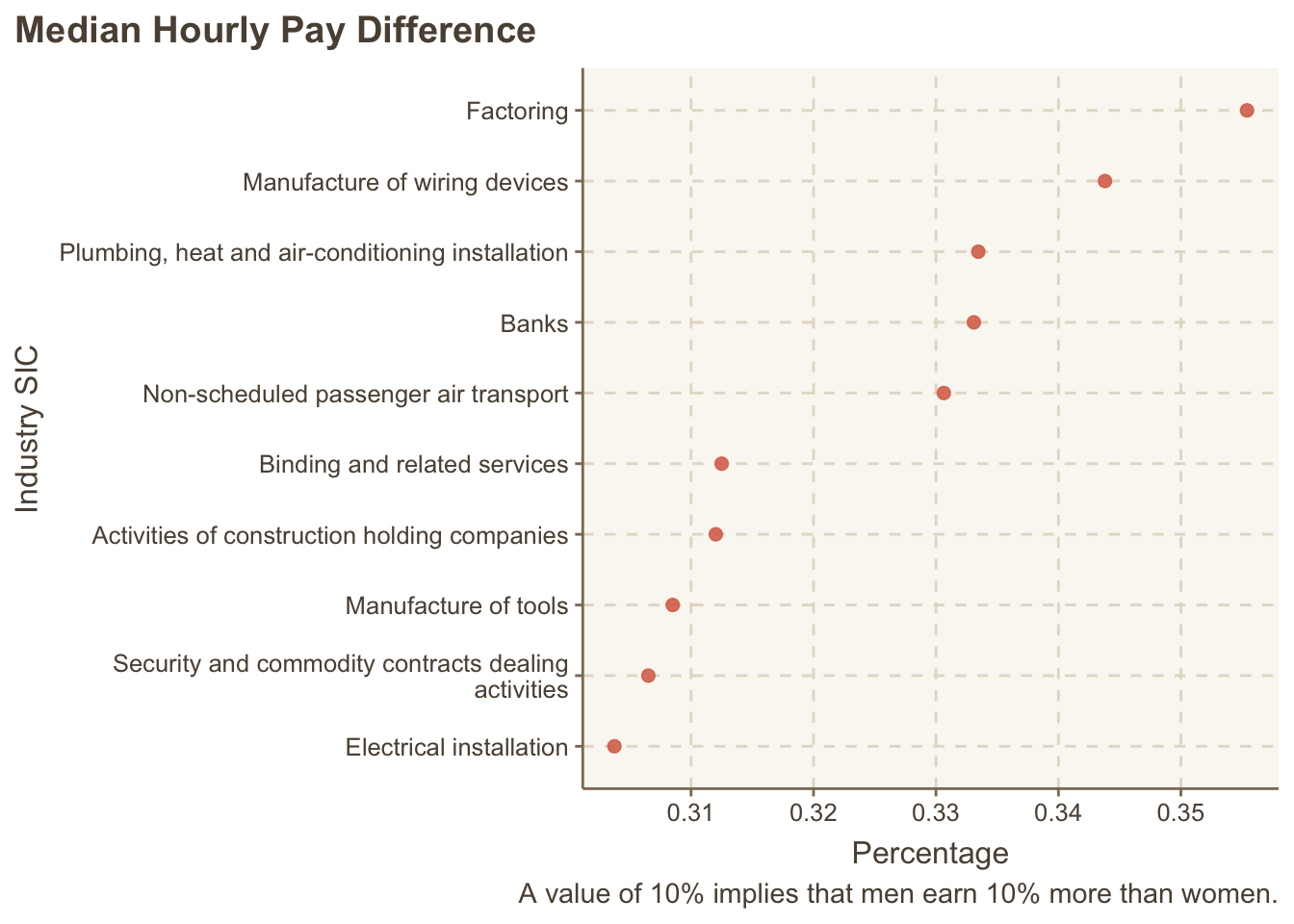
Industries with lowest (average) hourly median difference
paygap_joined |>
  mutate(diff_wage = diff_median_hourly_percent / 100) |>
  group_by(description) |>
  summarise(diff_wage = mean(diff_wage)) |>
  slice_min(diff_wage, n = 10) |>
  mutate(description = fct_reorder(description, diff_wage)) |>
  ggplot(aes(x = description, y = diff_wage)) +
  geom_point(alpha = 0.9, size = 2) +
  scale_x_discrete(labels = \(x) stringr::str_wrap(x, width = 50)) +
  labs(x = "Industry SIC",
       y = "Percentage",
       caption = "A value of -10% implies that men earn 10% less than women.",
       title = "Median Hourly Pay Difference") +
  coord_flip() +
  theme(plot.title.position = "plot")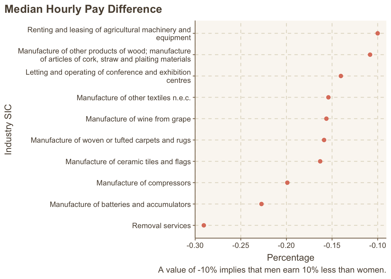
The differences are lowest in services and manufacturing activities (factory work).
These industry classifications are confusing; they provide too specific detail.
Let’s visualise the difference by words in description. Recall that we stored it in paygap data frame.
paygap |>
  group_by(word) |>
  summarise(diff_wage = mean(diff_wage)) |>
  slice_max(diff_wage, n = 10) |>
  mutate(word = fct_reorder(word, diff_wage)) |>
  ggplot(aes(x = word, y = diff_wage)) +
  geom_point(alpha = 0.9, size = 2) +
  labs(x = NULL, y = "Percentage",
       title = "Percentage increase in men's hourly wages compared to women's") +
  coord_flip() +
  theme(plot.title.position = "plot")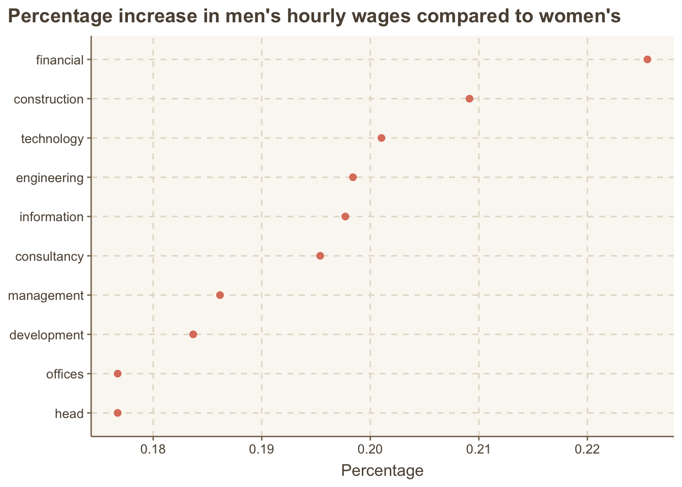
Education has the highest wage difference.
Let’s see which has the lowest wage difference.
paygap |>
  group_by(word) |>
  summarise(diff_wage = mean(diff_wage)) |>
  mutate(word = fct_reorder(word, diff_wage)) |>
  slice_min(diff_wage, n = 10) |>
  ggplot(aes(x = word, y = diff_wage)) +
  geom_point(alpha = 0.9, size = 2) +
  labs(x = NULL, y = "Percentage",
       title = "Percentage increase in men's hourly wages compared to women's") +
  coord_flip() +
  theme(plot.title.position = "plot")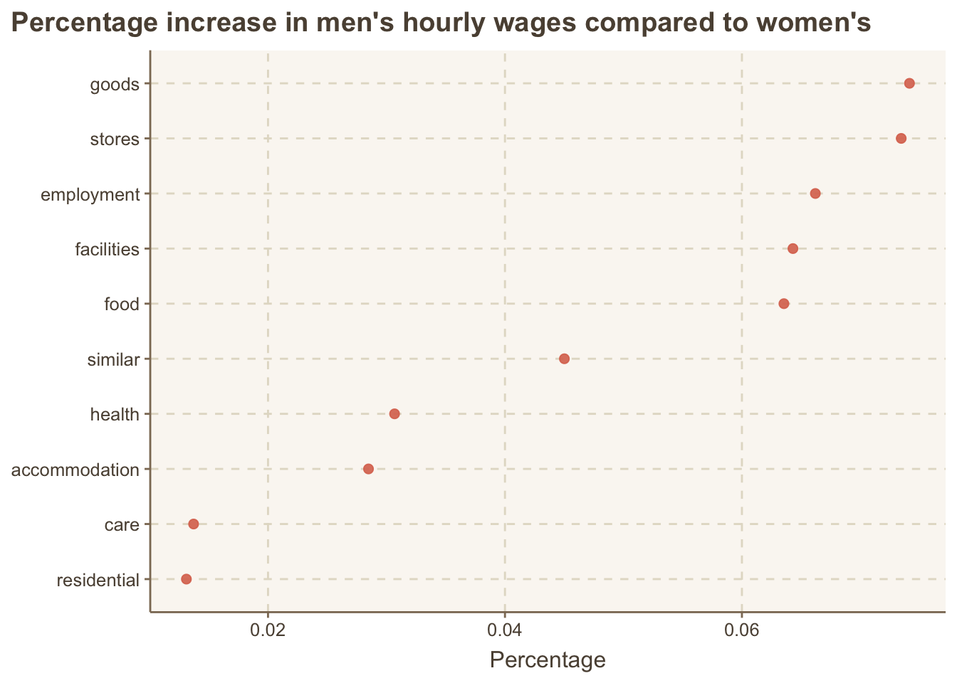
Management, business and transportation service businesses look like to have the least differences.
The average is not enough. Let’s fit a simple linear regression model.
I’m forcing the intercept to be zero as I’m only looking for the differences due to the word; else the difference should be zero.
paygap_fit = lm(diff_wage ~ 0 + word, data = paygap)
broom::tidy(paygap_fit)
## # A tibble: 40 × 5
##    term              estimate std.error statistic   p.value
##    <chr>                <dbl>     <dbl>     <dbl>     <dbl>
##  1 wordaccommodation   0.0285   0.00532      5.35 8.66e-  8
##  2 wordagency          0.0752   0.00546     13.8  5.22e- 43
##  3 wordbusiness        0.164    0.00314     52.3  0
##  4 wordcare            0.0137   0.00525      2.61 8.97e-  3
##  5 wordcars            0.157    0.00496     31.7  2.82e-218
##  6 wordconstruction    0.209    0.00401     52.1  0
##  7 wordconsultancy     0.195    0.00555     35.2  1.67e-268
##  8 worddevelopment     0.184    0.00569     32.3  5.43e-226
##  9 wordeducation       0.155    0.00458     33.9  1.53e-248
## 10 wordemployment      0.0662   0.00504     13.1  2.49e- 39
## # ℹ 30 more rows
ggstatsplot package provides beautiful ways to present these results.
library(ggstatsplot)
## You can cite this package as:
##      Patil, I. (2021). Visualizations with statistical details: The 'ggstatsplot' approach.
##      Journal of Open Source Software, 6(61), 3167, doi:10.21105/joss.03167

names(paygap_fit$coefficients) = str_remove(names(paygap_fit$coefficients), "word")

ggcoefstats(paygap_fit, output = "plot", sort = "descending",
            stats.labels = FALSE, exclude.intercept = TRUE,
            only.significant = TRUE) +
  scale_y_discrete(labels = \(x) stringr::str_wrap(x, width = 50))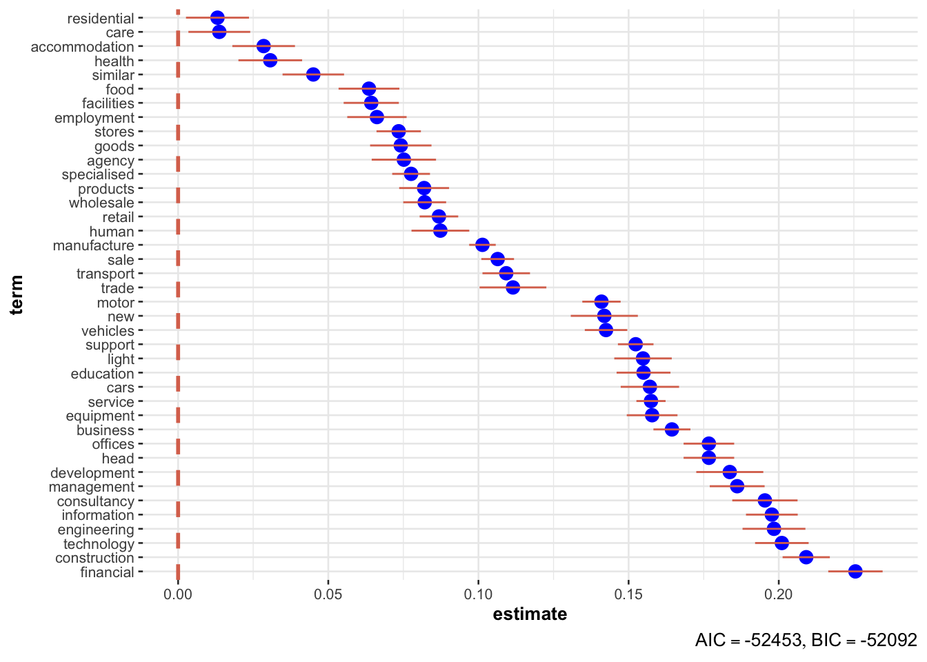
Primary education (and in general education) has the highest wage gap. Can any one explain that to me? (Note that in above plot, only significant variables are shown.)
What about differences by industries?
I’ll keep only top-10 industries and classify all others as “others”.
paygap_fit = paygap_joined |>
  mutate(diff_wage = diff_median_hourly_percent / 100,
         description = fct_lump_n(f = description, n = 10)) %>%
   lm(diff_wage ~ 0 + description, data = .)

broom::tidy(paygap_fit)
## # A tibble: 11 × 5
##    term                                   estimate std.error statistic   p.value
##    <chr>                                     <dbl>     <dbl>     <dbl>     <dbl>
##  1 descriptionActivities of head offices    0.164   0.00399      41.1  0
##  2 descriptionGeneral medical practice a…   0.107   0.00478      22.3  1.36e-109
##  3 descriptionGeneral public administrat…   0.0515  0.00361      14.3  3.48e- 46
##  4 descriptionGeneral secondary education   0.272   0.00285      95.5  0
##  5 descriptionOther business support ser…   0.143   0.00308      46.4  0
##  6 descriptionOther human health activit…   0.0280  0.00444       6.30 3.02e- 10
##  7 descriptionOther service activities n…   0.103   0.00540      19.1  3.04e- 81
##  8 descriptionPre-primary education         0.270   0.00579      46.7  0
##  9 descriptionPrimary education             0.292   0.00333      87.7  0
## 10 descriptionTemporary employment agenc…   0.0464  0.00462      10.0  1.09e- 23
## 11 descriptionOther                         0.111   0.000734    152.   0
Pictures!
names(paygap_fit$coefficients) = str_remove(names(paygap_fit$coefficients), "description")

ggcoefstats(paygap_fit, output = "plot", sort = "descending",
            stats.labels = FALSE, exclude.intercept = TRUE,
            only.significant = TRUE) +
  scale_y_discrete(labels = \(x) stringr::str_wrap(x, width = 50))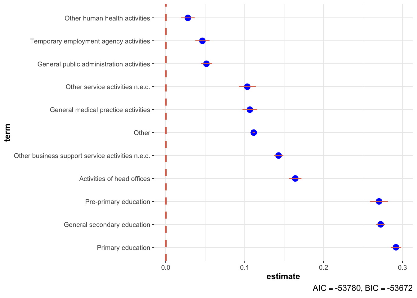
The difference is least in unlicensed cafes and restaurants, healthcare facilities and social work areas. That’s something positive. (Note that in above plot, only significant variables are shown.)
How does hourly pay gap correspond to bonus?
Hourly Pay and Bonus by Employer
I’m averaging the data we have for each employer. Each point represents a company. I’ve removed companies which had more than 50% difference in pay. It is sad in itself that we have those companies, but including them would worsen our plots and hide the cases where we can have significant impact.
paygap_employer = paygap_raw |>
mutate(diff_median_bonus_percent = diff_median_bonus_percent/100,
diff_median_hourly_percent = diff_median_hourly_percent) |>
group_by(employer_name) |>
summarise(diff_median_bonus_percent = mean(diff_median_bonus_percent, na.rm = TRUE),
diff_median_hourly_percent = mean(diff_median_hourly_percent, na.rm = TRUE)) |>
na.omit()
paygap_employer
## # A tibble: 13,636 × 3
## employer_name diff_median_bonus_pe…¹ diff_median_hourly_p…²
## <chr> <dbl> <dbl>
## 1 10 TRINITY SQUARE HOTEL LIMITED 0.545 10.3
## 2 123 EMPLOYEES LTD -0.441 32.5
## 3 123-REG LIMITED 0.402 18.1
## 4 1509 GROUP 0 13.8
## 5 1610 LIMITED -0.25 -35
## 6 1825 FINANCIAL PLANNING AND AD… 0.83 42.6
## 7 1879 EVENTS MANAGEMENT LIMITED 0.437 8.1
## 8 1LIFE MANAGEMENT SOLUTIONS LIM… 0.392 -18.4
## 9 1ST CHOICE STAFF RECRUITMENT L… -2.39 -1
## 10 1ST HOME CARE LTD. 0 0.1
## # ℹ 13,626 more rows
## # ℹ abbreviated names: ¹diff_median_bonus_percent, ²diff_median_hourly_percentpaygap_employer |>
ggplot(aes(x = diff_median_hourly_percent/100,
y = diff_median_bonus_percent/100)) +
geom_point(alpha = 0.3, size = 3) +
scale_x_continuous(limits = c(-0.5, 0.5), labels = scales::percent) +
scale_y_continuous(limits = c(-0.5, 0.55), labels = scales::percent) +
labs(x = "Hourly pay difference",
y = "Bonus pay difference",
caption = "Each point represents a company. I've removed companies which had more than 50% difference in pay.",
title = "How pay hourly pay and bonus difference vary by company") +
theme(plot.title.position = "plot")
## Warning: Removed 197 rows containing missing values (`geom_point()`).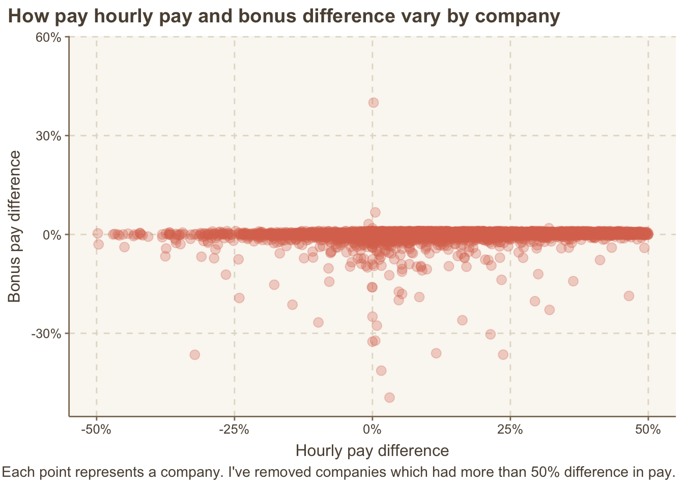
Hourly Pay and Bonus by Industry
We can also look at the differences by industry.
paygap_industry = paygap_joined |>
mutate(diff_median_bonus_percent = diff_median_bonus_percent/100,
diff_median_hourly_percent = diff_median_hourly_percent) |>
group_by(description) |>
summarise(diff_median_bonus_percent = mean(diff_median_bonus_percent, na.rm = TRUE),
diff_median_hourly_percent = mean(diff_median_hourly_percent, na.rm = TRUE)) |>
na.omit()
paygap_industry
## # A tibble: 609 × 3
## description diff_median_bonus_pe…¹ diff_median_hourly_p…²
## <chr> <dbl> <dbl>
## 1 Accounting and auditing activi… 0.179 12.2
## 2 Activities auxiliary to financ… 0.359 20.6
## 3 Activities of amusement parks … 0.187 3.75
## 4 Activities of business and emp… -0.0625 8.77
## 5 Activities of call centres 0.121 3.51
## 6 Activities of collection agenc… 0.250 8.74
## 7 Activities of conference organ… 0.311 10.7
## 8 Activities of construction hol… 0.448 31.2
## 9 Activities of credit bureaus 0.318 -0.88
## 10 Activities of distribution hol… 0.261 14.5
## # ℹ 599 more rows
## # ℹ abbreviated names: ¹diff_median_bonus_percent, ²diff_median_hourly_percentpaygap_industry |>
ggplot(aes(x = diff_median_hourly_percent/100,
y = diff_median_bonus_percent/100,
label = description)) +
geom_point(alpha = 0.3, size = 3) +
scale_x_continuous(labels = scales::percent) +
scale_y_continuous(labels = scales::percent) +
labs(x = "Hourly pay difference",
y = "Bonus pay difference",
caption = "Each point represents an industry.",
title = "How pay hourly pay and bonus difference vary by industry") +
theme(plot.title.position = "plot")
The two outliers are “Manufacturer of ceramic tiles” who pay 60% less bonus to women than men while having 16% less hourly wage, and “Retail sale of bread, cakes, flour confectionary and sugar confectionary in specialised stores” where women have 20% less bonus but 8% more hourly wage.
Hourly Pay and Bonus by Industry-Word
Recall that we found the top common words from the descriptions that represented the general ideas.
paygap_words = paygap_tokenized |>
  filter(word %in% top_words) |>
  transmute(diff_wage = diff_median_hourly_percent / 100,
            diff_bonus = diff_median_bonus_percent/ 100,
            word) |>
  group_by(word) |>
  summarise(diff_wage = mean(diff_wage), diff_bonus = mean(diff_bonus))
paygap_words
## # A tibble: 40 × 3
##    word          diff_wage diff_bonus
##    <chr>             <dbl>      <dbl>
##  1 accommodation    0.0285   0.0418
##  2 agency           0.0752  -0.220
##  3 business         0.164    0.0928
##  4 care             0.0137   0.000628
##  5 cars             0.157    0.347
##  6 construction     0.209   -0.0564
##  7 consultancy      0.195    0.243
##  8 development      0.184    0.168
##  9 education        0.155   -0.0361
## 10 employment       0.0662  -0.386
## # ℹ 30 more rows
paygap_words |>
ggplot(aes(x = diff_wage, y = diff_bonus, label = word)) +
ggrepel::geom_text_repel(size = 3) +
labs(x = "Hourly pay difference",
y = "Bonus pay difference",
title = "How does pay vary by industry?") +
theme(plot.title.position = "plot")
## Warning: ggrepel: 1 unlabeled data points (too many overlaps). Consider
## increasing max.overlaps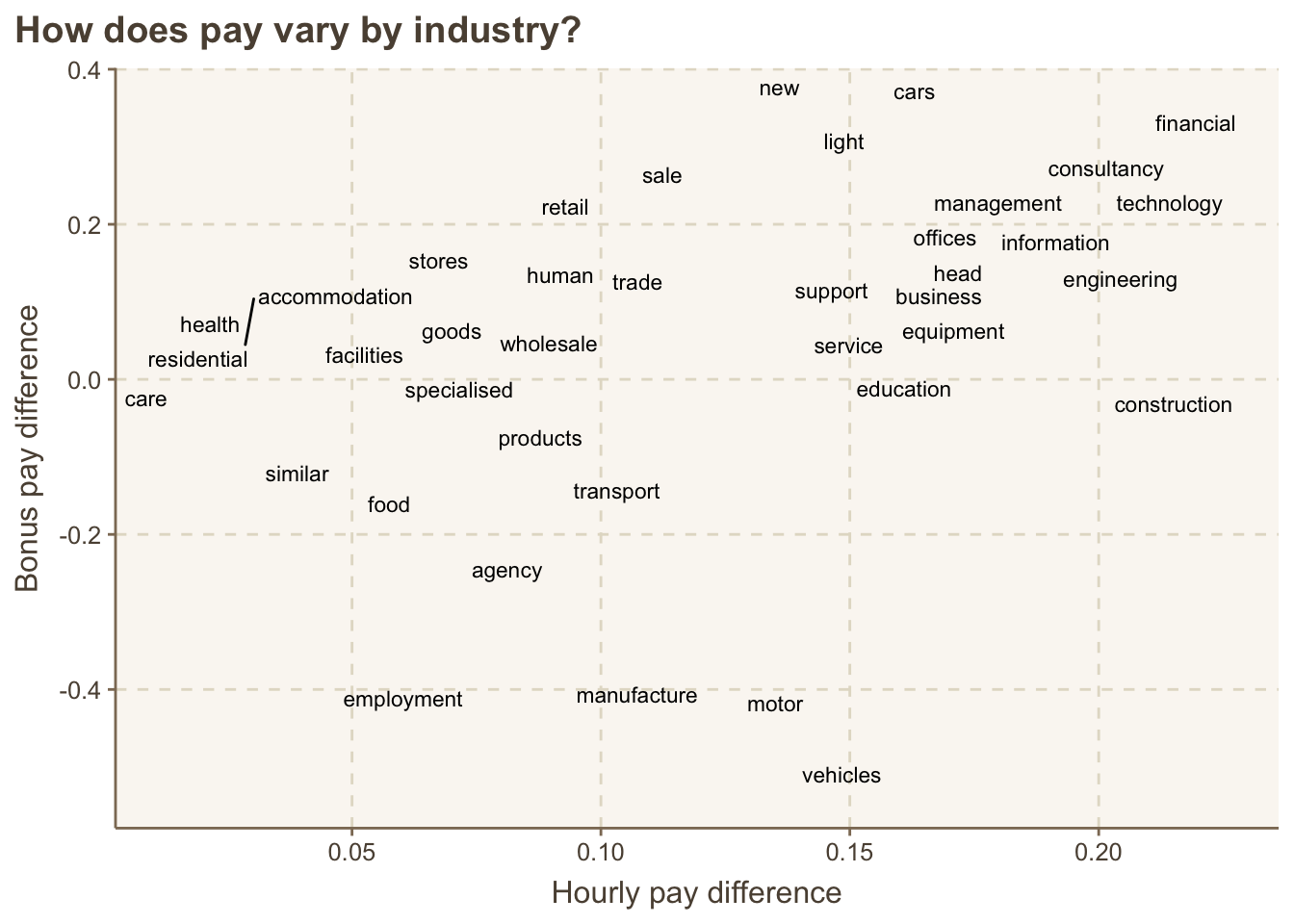
It’s 12:59 am now and I’m sleepy. Probably will pick this up again some day.

I somehow keep forgetting about
count()and end up grouping and summarising, which is a much more complicated way of achieving the same thing. Probably, I need to think of them as equivalent to pandas’value_counts().↩︎